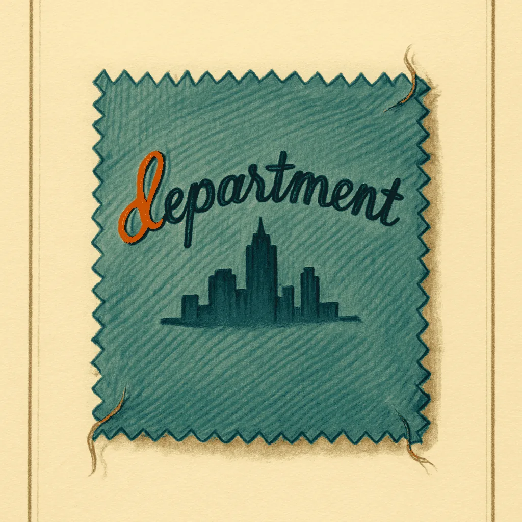
The label is woven, not printed. A serif name arches over a city — Cleveland, or New York, or San Francisco — and that is the whole tag. No fibre content. No RN number. No care symbols. No country of origin. The garment is a wool coat, the lining is acetate, the buttons are horn, and none of that is written down anywhere on the inside of the collar. The store did not think it needed to tell you.
That silence is the tell. A modern tag apologises for itself in four languages. This one does not. It gives you a name and a city and expects the rest of the transaction to happen in person, at the counter on the third floor, with a woman who has worked there since the war. If the coat did not fit, you brought it back. If the seam gave, you brought it back. The label was not a disclosure; it was an address.
Higbee, on Public Square. Bonwit Teller, on Fifth. I. Magnin, on Union Square. The house labels of the American department store between roughly the twenties and the early sixties share a posture, and the posture is confidence. The serif is Roman, often with a slight flare in the terminals — the sort of letterform an engraver would cut, not a typesetter would order. The city sits underneath in smaller caps, or curves along the lower arc of the cartouche. The whole mark is woven in a single colour on a satin-weave rayon ground, and the ground is heavier than anything a contemporary label uses. You can feel the tag before you read it.
What is not there is what dates it. The Wool Products Labeling Act came in nineteen thirty-nine, and enforcement thickened through the forties, but the fibre content line on a house label lagged well behind the letter of the law — the store's own mark did not carry it, a supplementary tag did, and the supplementary tag was often the first thing a tailor snipped out. RN numbers arrived in nineteen fifty-nine; before that, the WPL number, and before that, nothing. Care symbols are a nineteen seventy-one adoption at the earliest. A woven serif name over a city, with none of that around it, is speaking from before the paperwork caught up.
The typography narrows the window further. I. Magnin's mark, through the thirties and forties, sets the initial in a tall serif with a period, the surname in matched caps, and the whole line either straight or gently arched. Bonwit Teller favoured a lighter serif, almost a Didone contrast, with the ampersand — when it appeared — drawn as a proper glyph rather than typeset. Higbee's ran the name in a broader Roman, Cleveland underneath, and used a cartouche border more often than the others. The border matters. A cartouche or a laurel or a small crest tells you the label was designed as an heraldic object, not a compliance object. That instinct fades by the mid-sixties, and by the seventies the house label has become a rectangle with a fibre line and a lot number.
The ground fabric is the second reading. Pre-war house labels sit on a woven rayon satin that yellows in a particular way — warm, uneven, concentrated at the fold. Post-war into the fifties, the ground brightens; the rayon is more consistent, the weave tighter. By the late fifties the ground begins to shift toward acetate, and the hand of the tag changes — thinner, cooler, less willing to hold a crease. A tag that has yellowed evenly across the whole face was probably stored flat in a drawer. A tag that has darkened only at the top edge sat on a hanger, collar folded down, for forty years.
The store expected you to bring it back.
That is the sentence the label is really saying. Everything else — the serif, the city, the woven ground, the absent fibre line — follows from it. The tag is not there to inform a stranger. It is there to remind a customer whose account is already on file. When the account system dissolves, so does the tag; the rectangle with the RN number is a label for a garment that will be sold once, to someone the store will never see again.
So when a serifed name over a city turns up inside a collar, with nothing else beside it, look at the ground first and the letterforms second. Woven satin, warm yellow, Roman serif, cartouche — that is a nineteen-forties placement, comfortably, and possibly earlier. One observation, then you decide. The tag has already told you what kind of store it came from, which is most of the work.