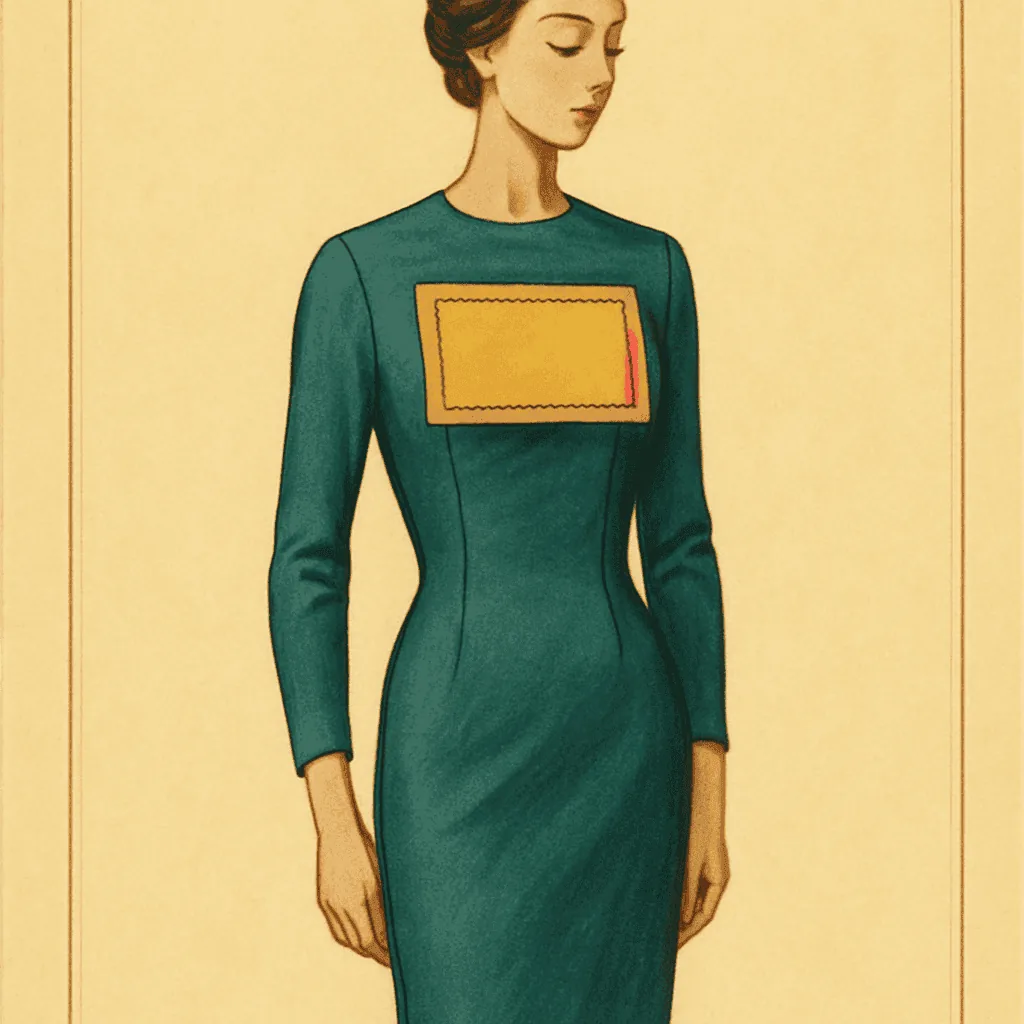
A blouse comes across the table with a label the size of a playing card. Mustard ground, violet lettering, a sans-serif so confident it reads like a poster. The label is sewn high on the placket, flat, unlined. You notice it before you notice the fabric. That is not an accident of storage or a later alteration. That is the point. Someone in a boutique in London or New York, sometime around nineteen sixty-six, decided the tag should do half the talking.
Most tag reading assumes the label is hiding. You look for the union mark, the RN number, the fibre content line, and you piece the decade together from features the maker never expected a customer to study. The mid-sixties boutique label breaks that assumption. It is loud on purpose. It wants the wearer to know where the garment came from, and it wants the friend across the room to know too. Which means the usual reading order changes. The font is doing the talking here, and the font was designed by someone whose name was on the door.
Biba is the cleanest example. The Art Nouveau curl, the black-on-gold, the logotype tighter than any American maker would have tolerated — that label was drawn by a graphic designer, not a garment-industry printer. Paraphernalia, on Madison Avenue, ran a different aesthetic but the same instinct: oversized woven labels, painterly colour, brand mark set in display type rather than the neat serif capitals the trade preferred. Mr. Freedom in London went further, printing the tag on the outside of the garment on occasion, treating the label as placement art. Three boutiques, three cities, one shift. The label stopped being paperwork and started being design.
The features that confirm the placement are worth naming, because the loud graphic can distract from them. Woven, not printed — a mid-sixties boutique cared enough to weave the label, even when the graphic language was pop. The label stock is heavier than a mass-market tag of the same year; you can feel it between finger and thumb. The stitching is usually a plain lock-stitch, close to the collar band, no reinforcement bar. Fibre content is often present but tucked to a secondary label lower down; the display label at the neck carries the name and nothing else. That secondary label is where the decade actually confirms — care symbols will not appear until seventy-one, and if you see them on what looks like a Biba, look again at the seam finish before you commit.
Origin follows the same logic. A Biba label reads Biba of London or Biba Kensington through the sixties; the shorter marks come later. Paraphernalia labels name the New York address on the secondary tag, not the display one. Mr. Freedom's early pieces sometimes carry only the shop name and a King's Road reference, no fibre content at all — which, on any other garment, would be a problem. On a boutique piece from sixty-eight, it is consistent with how the shop operated. The country of origin line, when it appears, is the tell that separates a shop-made piece from a licensed reissue two decades later.
The label is not evidence in the usual sense. It is the argument the garment was making about itself.
Which is why these tags misdate so often when read by the usual method. A collector looks for the union label and does not find it, looks for the RN number and does not find it, and concludes the garment is later than it is. The absence is the period detail. Small boutiques operating outside the standard American manufacturing chain did not carry ILGWU marks; they did not need RN numbers if they were not registered with the FTC as a domestic manufacturer in the ordinary way. The seam finish gives the decade away here more reliably than the paperwork does. Overlocked interior seams, a lock-stitched hem without a serger pass, a plain lining if any — that is sixty-six, sixty-seven, sixty-eight, comfortably.
So when a label arrives that seems to be shouting, the instinct to distrust it is worth resisting for a beat. Look at the weave of the tag, the weight of the stock, the placement on the placket, the stitch that holds it. Then look at what is missing — the union mark, the care symbols, the fibre line pushed to a second tag. The loud graphic and the quiet omissions belong to the same moment. One observation, then you decide. The tag was designed to be seen; you are only doing what the boutique asked.